MySQL Enterprise Monitor 8.0 Release Notes
Each group, cluster, and asset displays a different set of default sparkline graphs. The default graphs are directly relevant to the selected asset.
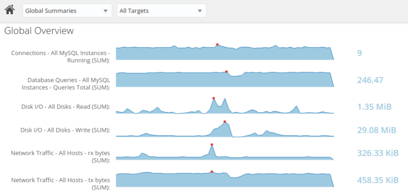
For example, the Global Overview displays the following by default:
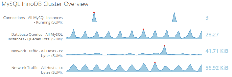
The MySQL InnoDB Cluster Overview displays the following graphs by default:
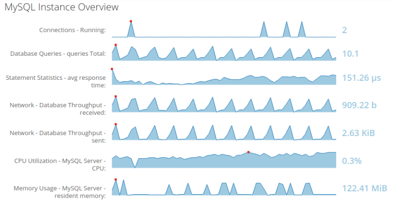
If you select an individual asset, such as a MySQL Instance, the following, default graphs are displayed:
Note
The red points are the highest value, while the values in blue, at the right side of the graph, are the most recent values.
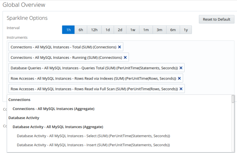
The graphs are customizable. To change a graph, do the following:
Select the Settings button, the gear on the right side of the Overview page. The Instruments list is displayed:
Click inside the Instruments field and select the required graph from the drop-down list.
To remove a graph, click the X in the top-right corner of the graph name.
To close the Instruments list, click the gear icon again. Your selection is saved for all future sessions.
To reset the sparklines to the default, open the Instruments list and click the Reset to Default button.
To set a time interval for the graph data, select one of the interval values. The interval is saved for the selected targets.